Shea McCombs
1999
Revised in 2009
1999
Revised in 2009
A Crash Course in Computer Graphics
These three pages are meant for people who wish to further their fundamental understanding into the building blocks of modern computer graphics. First, we will start with the basics of color.
Color Systems
Additive and Subtractive colors
First are the different types of color systems: additive colors and subtractive colors. Additive colors are used on all light-driven image systems, including monitors, TVs, laptops, spot lights, etc etc. In this system, light primaries are added to each other to get a desired color. Our eyes pick up three primary colors: Red, Green, and Blue. What we see as color are simply different frequencies of light reacting with the cones in our retinas. The primary colors of the additive color system are also Red, Green, and Blue. When all three colors are mixed, the result is pure white.
Subtractive color systems, however, take advantage of absorbing (or subtracting) from the light primaries. This system is used in all printing, inks, and pigments. For example, say you shine a white light onto a red surface. The white light is made of equal amounts of all three primary colors. The light then hits the red surface, but the surface isn't really red, it's only reflecting red. To reflect red, you need to mix magenta and yellow together. To see why, look it on a simpler level, magenta reflects both red and blue, while yellow reflects both red and green. What do the two colors commonly reflect? Red! The other two are canceled out. The subtractive pigmentation on the surface subtracts (absorbs) blue and green light, leaving only the red light, which is then recieved by our eyes. The three primaries in the subtractive color system are Cyan, Magenta, and Yellow. When all three colors are mixed, the result is black.

As you can see above, when two primaries in the additive color system are added, the result is a primary from the subtractive color system, and vice versa.
If you use RGB as the base color system (which we should, since its the system our eyes actually use), you should know that a magenta pigment is actually just subtracting green light, thus reflecting red and blue to us. And, as we all know, red and blue make purple (I mean ... magenta)!
Likewise, a cyan pigment simply subtracts red, and reflects everything else, leaving us with blue and green. In the additive system, blue and green make cyan.

Most all work on the computer will be done by the use of the RGB system. Some image editors like Photoshop will allow you to work with CMYK colors for print compatibility, but the editor converts the CMYK colors to RGB behind your back so the monitor will display it properly.
The Hue - Saturation - Value color system
An alternate to RGB when working with color is HSV, for Hue-Saturation-Value. It is also sometimes called HSB where Brightness is used in place of Value. There is a third variation called HSL, which deals with Luminance instead of Value or Brightness, but it is fundamentally different and won't be discussed here. Just remember, there is a difference!
The HSV system, like the RGB system, uses three numbers to create a color.
The first number, hue, determines the actual tone of the color. If you imagine all the colors of the rainbow stretched around a wheel, then a particular color's hue is a specific angle on that wheel.

Notice the three light (additive) primary colors in the wheel, marked by numbered circles, are exactly 120 degrees apart. Red is located at 0 degrees, green is at 120, and blue is at 240. Also, you get the three secondary colors in the wheel too: yellow, cyan, and magena. They are also exactly 120 degrees apart. Yellow is at 60 degrees, cyan is at 180, and magenta is at 300 degrees.
Looking at the wheel, there are certainly plenty of colors. It is a color wheel, after all. But are these really all of the colors? Well, let me ask you -- where is tan on the wheel? How about beige? Slate blue? Or the color of an old tarnished copper penny? For that matter, where is black, white, or gray?
Those colors don't exist on the color wheel. At least, not to us. They all consist of more properties than hue alone can describe. Some are darker, some are lighter. Some of them are dull, gray, or pastel. It would seem we're in need of more than just hue ... oh, yeah! That's where saturation and value come in!
Saturation describes how pure a color is. In our day-to-day reality, it is very rare to see pure colors. Most of the things we see are going to be relatively dull. More precisely, when a color is rather dull and subdued, we say the color is desaturated. Since real-life colors are so boring, saturated colors are often used to grab your attention. You proably see them on late night infomercials or car dealership ads. You probably even see them on those insane Christmas decorations your neighbor put up this year. They have their place, but should be used with discretion.
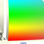
Below is an example of hue and saturation displayed together. Along the left edge of the sheet, you see the entire hue range from 0 degrees to 360 degrees. Along the bottom edge, you see saturation. This is usually given as a percentage, where 0% is gray, and 100% is a pure eye-numbing color.


 Tutorials

